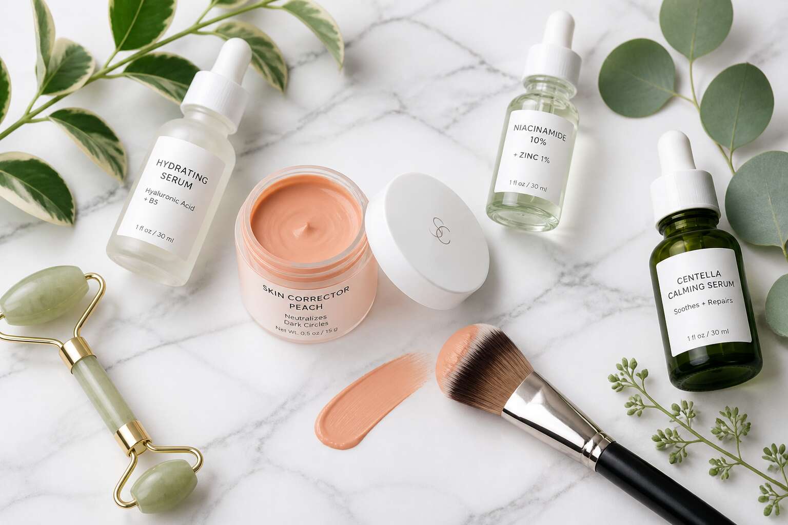
Understanding Skin Pigmentation and Color Correction
The Science of Pigment Overproduction
Nearly 30% of dermatology consultations in South Africa involve pigment disorders. I find that figure shocking!
The reason for this prevalence lies in melanocytes, the cells responsible for skin color, which overreact to certain triggers. Overproduction happens when tyrosinase, an enzyme, converts tyrosine into melanin at an excessive rate. The visible result is hyperpigmentation, including dark spots, melasma, or uneven tone.
A pigment corrector acts on this enzymatic step. It regulates tyrosinase activity, thereby lowering melanin output. This is not about masking the problem. The science is clear. Common causes of pigment overproduction include:
- Repeated UV exposure without protection
- Inflammation from acne or eczema
- Hormonal changes during pregnancy or menopause
Each of these factors boosts melanin synthesis. Understanding this pathway helps you select a pigment corrector that addresses the cause rather than merely covering symptoms.
How Complementary Colors Neutralize Dark Spots
Here’s a secret the cosmetics industry hopes you never learn: color correction is pure geometry. The color wheel, specifically. Complementary colors sit opposite each other, and when they meet, they cancel out. Your dark spot is essentially a brown patch. A peach or orange pigment corrector is its direct opposite. Apply one over the other, and the brown neutralizes to a more even tone.
I should clarify, this isn’t about erasing pigment. It’s about optics. The corrector changes how much of the dark area your eye registers. That’s why a pigment corrector with a warm undertone works best on cooler-toned dark spots. A simple calculation, not a miracle.
- Brown or purple dark spots respond to peach and orange correctors
- Redness responds to green
- Lavender handles dull, sallow tones
Pick your shade, apply it thinly, and let the color wheel finish the job. Your foundation gets the day off!
Choosing the Right Formula for Your Concern
Peach and Orange Correctors for Dark Circles
Most dark circles are not one shade! They shift with fatigue, hormones, and even lighting. That is why choosing a pigment corrector depends on your specific concern, not a generic rule. I always tell clients to inspect the under-eye area in daylight, because indoor lights conceal the true depth.
For fair to light skin with blue under-eye veins, peach works best. It lifts without looking chalky. For medium to tan skin, orange cuts through the grey or brown cast that peach cannot completely neutralize.
Formula weight changes the result. A balm gives more coverage for deep circles. A liquid sheers out for daily wear. Swatch on your jawline, not your hand. The undertone must match your skin, not your arm. A thick cream may crease, so press it gently with your ring finger.
Green Correctors for Redness and Rosacea
Over three million South Africans live with rosacea, yet most treat it with concealer and hope. Green pigment corrector cancels the persistent flush before foundation even goes on. The formula choice matters more than the shade!
Options vary in texture and behaviour:
- Cream formulas sit on dry, flaky patches without clinging to texture
- Liquid versions suit oily skin, where heavy creams slide off by lunchtime
- Stick formulas offer portability but drag on sensitive skin
For rosacea flare-ups, the green corrector goes only on affected areas. Spreading it across the entire face dilutes the effect. The green tint should disappear once blended, leaving a neutral base. I have watched people apply green corrector to their whole face and wonder why they look sallow.
Lavender Correctors for Sallow Skin
Sallow skin is the quiet complaint behind many foundation purchases in South Africa. A lavender corrector uses violet to cancel the yellow cast that appears when circulation slows or sun damage deepens undertones. This concern needs a specific pigment corrector, chosen with more care than the shade name suggests.
Cream formulas melt into dry winter skin, while liquids sit better on combination complexions. Stick versions drag over the texture around the nose, so leave those for travel! The formula choice changes how the violet behaves.
Look for these markers in a product:
– A blue-violet base, not a pink one
– Enough pigment to shift your undertone in one layer
– A finish that matches your foundation type
Lavender suits light to medium skin with a yellow bias. Deeper complexions need a violet with a stronger base, applied before foundation, only where the sallow cast appears. When blended, the skin’s brightness returns without a grey residue.
Yellow Correctors for Bruises and Dullness
Yellow correctors remain the least glamorous member of the pigment corrector range, but they solve a particular geometry: the purple of a bruise, the grey of exhaustion. On South African skin, especially in dry Highveld winters, the right yellow brings warmth back without making you look jaundiced.
The formula determines everything! A stiff stick tugs at bruised tissue, so I prefer a cushiony cream that spreads like soft butter. The pigment needs to be concentrated enough to cancel the bruise in one pass, yet sheer enough to never look like face paint.
- Fresh bruises carry red tones; choose a yellow with peach undertones.
- Old bruises turn bluish; choose a pure lemon yellow.
That distinction is where most pigment corrector shades fail. They cover all yellows with one shade, and the result is ashy. When the yellow matches the bruise’s stage, the dullness lifts naturally.
Blue Correctors for Deep Undertones
Blue correctors rarely make it into beauty kits, which is odd because they handle a genuine problem for deep South African skin: cool undertones turn orange after a few hours of wear. Most formulations assume one shade works for all deep skin, but that is false. A cool undertone needs the blue to neutralise the amber. A warm undertone needs only a trace.
- Your foundation oxidises to copper by noon.
- Sun exposure leaves an orange tint that concealer cannot hide.
- Your current concealer sits grey on your jawline.
Fluid gel textures spread without pulling; stick formulas drag. That difference determines whether the pigment corrector disappears into skin or remains visible.
Salmon and Red Correctors for Deep Skin Tones
For deep skin, the difference between salmon and red correctors comes down to undertone. Salmon lifts brown-purple circles on tan complexions. Red cancels the violet-black under-eye shadow of deeper melanin levels. A pigment corrector with a cream base melts into dry skin; a serum texture saturates oily zones without shifting. Application technique dictates the finish. A stippling brush leaves a thin layer of colour. A fingertip pressure builds intensity.
When the shade is right, the corrector disappears. When it is wrong, it remains a visible pastel layer. Use this guide:
- Salmon for golden undertones and mild darkness.
- Red for neutral undertones and deep blue undertones.
- Test on the jawline for ten minutes to check oxidation.
Blend until the edge dissolves into the foundation.
How to Apply Pigment-Neutralizing Cosmetics Like a Pro
Prepping Your Skin for Optimal Color Cancellation
The outcome of your pigment corrector begins before the first drop touches your skin. In Cape Town’s coastal breeze or on the dusty roads of Durban, your skin’s hydration level changes daily. A dehydrated complexion absorbs the corrector unevenly, leaving pale streaks across the cheekbones.
Cleanse your face and inspect it under natural light. If you see flaking, wait. Apply a humectant serum with hyaluronic acid, then a light occlusive moisturizer to trap that moisture. Pat the skin dry, never rub.
For precise placement:
- Shake the pigment corrector bottle to suspend the color particles.
- Dot the corrector on the darkest area of the discoloration only.
- Use your ring finger to press the product into the skin’s surface.
Three minutes of waiting allows the color to oxidize slightly and bond with your natural undertone. The result is a seamless correction that matches your natural feel.
Layering Correctors Under Foundation
On the humid morning when your foundation looks grey, the pigment corrector quietly corrects the undertone before the first layer of foundation touches your skin. Press it into the darkest spot with the pad of your middle finger, starting at the epicentre and feathering outward. A thin layer is enough. Thicker coats shift under foundation.
After three minutes, once the corrector has bonded, apply your foundation with a damp sponge. Use a stippling motion, never a swipe. This preserves the colour cancellation while allowing the base to glide. On Cape Town’s windy streets, a setting powder over the foundation locks the work, though a spray is gentler for mature skin.
Blending Techniques for Seamless Coverage
Your palm is warmer than your fingertips, and warmth helps any pigment corrector blend with greater ease. Press the product between your ring fingers, then transfer it to the skin using a rolling motion rather than a drag. I have found this “press and roll” technique allows the corrector to settle into the tissue without disturbing layers of hydration.
A flat synthetic brush handles larger zones like cheeks, while the ring finger remains best for the periorbital area. For textured skin, a damp sponge squeezed until barely moist can diffuse the edges. The difference is subtle but real!
- Sections of about two square centimetres each
- Eight seconds between each press
- Natural daylight checks before foundation
Patience, more than pressure, determines the result. A pigment corrector that looks patchy up close becomes invisible once the sponge passes over it in a stippling rhythm, provided the edges are blended until imperceptible first.
Setting Correctors for Long-Lasting Wear
A pigment corrector that fades by noon has failed its primary function. The skin’s natural oils, combined with expression movement, work against any corrective layer. Setting is the difference between a temporary disguise and a lasting neutralisation.
Three enemies undermine wear time:
- excess sebum breaking down the pigment matrix
- dry flakes lifting the colour from the surface
- moisture from skincare or humidity destabilising the formula
Counter each with a strategic barrier. A thin veil of translucent powder, applied with a velour puff, anchors the pigment corrector without shifting its colour. For the periorbital zone, I use a damp puff to set while retaining hydration. A fixing mist with a fine nozzle, held twenty centimetres away, fuses the layers without disturbing them.
Key Ingredients and Product Innovations
Niacinamide and Vitamin C for Brightening
Hyperpigmentation demands more than camouflage. The modern pigment corrector now pairs color science with active brighteners like niacinamide and vitamin C. Niacinamide interrupts melanin transfer to surface cells, while vitamin C blocks the enzyme tyrosinase. Together, they fade stubborn marks while the corrector neutralizes tone.
Innovations in delivery systems have shifted expectations. Encapsulated vitamin C resists oxidation, and time-released niacinamide prevents flare-ups. These advances let a single formula work beneath foundation without pilling or irritation.
- Liposomal vitamin C for deeper penetration
- Niacinamide at 5% for barrier support
South African brands are adapting these ingredients to humid climates and melanin-rich skin, ensuring that every layer you apply fights the spot, not the skin.
Purple and Blue Pigments for Photochromic Adjustment
Photochromic pigments respond to UV exposure, and this changes how a pigment corrector behaves on melanin-rich skin. Purple and blue tones now adjust their intensity as light shifts, preventing the chalky cast that static formulas leave behind.
One unexpected benefit is the way these pigments interact with formulation chemistry. Encapsulated dyes hold their charge longer, and in humid climates, they resist shifting into grey. I have seen South African brands pair this with a lighter base, so the product looks natural.
- Purple neutralizes yellow undertones in daylight.
- Blue cancels deep orange shadows under artificial light.
That dual action helps the formula stay effective as light changes.
Lightweight vs. Creamy Formulas for Different Skin Types
South African summers are unforgiving, and a pigment corrector must perform under intense humidity. The latest formulations have responded by moving away from heavy pastes toward skincare-driven textures. I have watched this evolution with great interest.
Key ingredient innovations include oil-absorbing silica spheres and encapsulated colorants that release slowly during wear. This prevents the grey cast that once plagued deeper skin tones. For combination skin, the difference is significant!
- Hyaluronic acid maintains hydration without grease.
- Niacinamide appears at lower concentrations to avoid irritation.
- Iron oxides offer stable, non-streaking pigment.
Lightweight formulas suit oily and acne-prone skin, providing a matte finish that survives humidity. Creamy formulas benefit dry or mature skin, relying on shea butter and squalane to prevent flaking. The innovation lies in the base, not the color!
Cruelty-Free and Clean Beauty Options
The clean beauty movement now extends to colour correction. South African shelves hold correctors that pair ethics with efficacy, using biofermented actives and plant-derived squalane instead of animal-derived fillers. These formulas rely on enzymatic brighteners from papaya and pineapple to break down excess melanin without harsh abrasives.
Key ingredient innovations include:
- Microencapsulated bakuchiol for gentle cell turnover
- Fermented yeast filtrates to calm inflammation
- Carbon-neutral pigments from mineral clays
Cruelty-free certifications are common, but the real shift lies in waterless concentrates that reduce preservative load. A pigment corrector from a local brand might feature rooibos extract, a native antioxidant, to stabilise colour while protecting skin. This matches clean beauty principles without sacrificing performance.
Top-Rated Product Formats: Creams, Palettes, and Pens
A recent cosmetech survey shows that 64% of women in Gauteng reach for colour-correcting palettes first, not single shades. That preference has reshaped how the pigment corrector market designs its formats. Creams, palettes, and pens now carry distinct innovations.
Creams hold the heaviest pigment density. They use mica coated with calcium carbonate for a smooth, buildable layer. Palettes let you mix shades for different darkness levels, which helps when your seasonal tan shifts. Pens deliver a fine line, perfect for stippling over specific marks without dragging the skin.
- Creams suit normal to dry skin thanks to their occlusive texture.
- Palettes offer flexibility for travel and multi-tonal faces.
- Pens reduce waste and provide controlled application for small areas.
One new advance is the ceramide-emulsion pigment corrector, which stabilises colour with biofermented oils. This prevents separation in warm coastal climates, a common issue with older formulations. The result is a product that stays reliable from Cape Town to Durban.
Expert Mistakes to Avoid and Pro Tips
Using Too Much Product and Causing Pale Cast
One of the most counterintuitive errors I see is the pale cast that follows an overzealous hand. You think you are neutralizing, but you are actually creating a new problem. A pigment corrector is not a concealer. It is a targeted intervention.
When you apply too much, the corrector’s own base pigment shows through, especially on deeper skin tones. The result is a chalky, ashy film that no foundation can fully mask. The fix is restraint! Use a flat brush to deposit a whisper-thin layer, then assess under natural light.
- Start with half the amount you think you need.
- Wait sixty seconds for the color to oxidize before judging.
- Blend outward from the darkest point of the spot.
This approach preserves the pigment corrector’s intended effect without sacrificing your skin’s natural warmth.
Forgetting to Color-Correct Before Concealing
Rushing through your routine often leads to skipping the pigment corrector entirely. You reach for concealer first, hoping it will handle everything, but it only masks the surface. The underlying discoloration seeps through, leaving your base with uneven patches that no amount of layering can fix.
Make color correction a non-negotiable step before any concealer. Apply a thin layer, let it set, then build coverage. Here are three reminders to keep you on track:
- Place your corrector next to your concealer so you see it every morning.
- Use a mirror with natural light to spot missed areas.
- Set the corrector with powder before adding concealer for better adherence.
This habit saves time and product, and your skin looks even without extra layers.
Ignoring Skin Undertones When Selecting Shades
Choosing a pigment corrector without reading your cutaneous undertone creates a second problem instead of solving the first. The surface hue of a dark spot is misleading. What actually matters is the blood and melanin tone underneath. Warm undertones need yellow green to cancel redness. Cool undertones need blue green. Swap those and the skin shifts grey, not neutral.
- Your base looks dusty within an hour
- The corrector refuses to blend into surrounding skin
- The shade oxidizes into an unnatural tint
South African light complicates this further. A pigment corrector that holds in Cape Town mornings can turn hostile under Johannesburg afternoon sun. The jawline, checked in direct natural light, reveals the true undertone. The wrist does not. Evaluate the face, not the arm.
How to Test Correctors on the Right Skin Area
The inner wrist swatch is the cosmetic equivalent of trusting a stranger’s directions. That sliver of skin has never seen a Cape Town summer, hormonal fluctuation, or the particular stubbornness of a dark spot. The jawline has. When testing a pigment corrector, apply it there and step into direct natural light. Shop lighting flatters; natural light dissects. Give the formula three minutes to settle before judging, as oxidation reveals itself only after the first minute.
Even seasoned makeup artists fall into lazy habits:
- Testing over foundation instead of clean, primed skin.
- Ignoring the neck’s tone, which in South African light always differs from the jaw.
- Selecting a corrector shade indoors, then wondering why it greyed by noon.
The right area, the right wait, and the right light source prevent a dusty finish. Your face, unlike your wrist, holds strong opinions about pigment corrector. Listen to it.
Troubleshooting Oxidation and Creasing
An expert mistake is treating oxidation as a product failure. Oxidation is a reaction between the formula and your skin’s oils, pH, and the humidity of a Johannesburg summer. A pigment corrector that shifts orange by noon is a timing failure. Wait three full minutes to assess the true shade. If it still creases, you are layering cream over cream without letting each film set. Artists pile on powder; the corrector then dries into cracks.
Pro troubleshooting requires strategy:
- Apply films so thin you question them; excess creates creases.
- Set the corrector with finely milled powder before concealer, not after.
- Match your primer’s base; water over silicone splits into lines.
Check every edge in natural light before foundation. What looks matte in a mirror settles by afternoon! Oxidation reveals itself after the first minute, but creasing shows up later. A pigment corrector failing both tests needs a lighter application.



0 Comments